I stumbled across a print copy of Dürer's Of the Just Shaping of Letters in a second-hand bookshop years ago. This slim book — an English translation of part of book three of Dürer's Applied Geometry from 15351 — contains descriptions of how to draw uppercase Latin letters2. Each letter is described as a series of geometric instructions and relationships within the containing square.
As far as I am aware, Dürer is not known as a typographer per se, these letter forms are presented as a description of a how letters may be formed, rather than as a description of a specific designed typeface, they seem to be intended for an audience designing monumental stonework rather than cutting typefaces.
My interest is particularly piqued because the descriptions are close to being algorithms for each letter, the geometric instructions amount to a constraints system.
Earlier this summer I transcribed each letter into JavaScript, and over the last few days ported that to CoffeeScript (mostly just because, and what better thing to do on a Hawai’ian beach in between stand up paddle boarding and drinking daiquiris). The original lacks descriptions for J, U, and W because they weren’t/aren’t Latin letters - but I added versions. Several of the letters have variants, I only chose one in most cases.
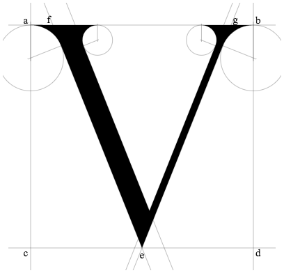
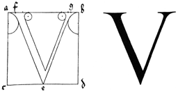
As an example, here is the original description of the letter ‘V’ — chosen to be a short description, but not too short!
V you shall thus make in its square: Bisect c. d. in the point e.; then set the point f. one-tenth of the whole line a. b. beyond a., and in like fashion g. to the hither side of b. Then draw the broad limb of your letter downwards from f. to e. and sharpen it; & thence draw upwards your slender limb to g.; and at the top produce it in either direction, as you did before at the bottom of A; just as you see it shown below.
The CoffeeScript is not quite as pithy, but is also doing a little more housekeeping...
  drawV: (id, variant, proportions) ->
    outline = new OutlineDrawer sys.ctx

    outline.drawLine @labels.a, @labels.b
    outline.drawLine @labels.c, @labels.d
    outline.drawLine @labels.a, @labels.c
    outline.drawLine @labels.b, @labels.d

    @labels.e = midPoint @labels.c, @labels.d
    @labels.f = @labels.a.towards @labels.b, @serif
    @labels.g = @labels.b.towards @labels.a, @serif

    ll_tr = @labels.f.towards @labels.b, @wide
    ll_trr = ll_tr.towards @labels.b, @serif
    ll_br = @labels.e.towards @labels.d, @wide

    outline.drawLine @labels.f, @labels.e
    outline.drawLine ll_tr, ll_br
    llls = outline.drawTouchingCircle @labels.e, @labels.f, @labels.a
    llrs = outline.drawTouchingCircle ll_trr, ll_tr, ll_br

    rl_tl = @labels.g.towards @labels.a, @narrow
    rl_tll = rl_tl.towards @labels.a, @serif
    rl_bl = @labels.e.towards @labels.c, @narrow

    outline.drawLine rl_tl, rl_bl
    outline.drawLine @labels.g, @labels.e
    rlls = outline.drawTouchingCircle rl_bl, rl_tl, rl_tll
    rlrs = outline.drawTouchingCircle @labels.b, @labels.g, @labels.e

    render = new FillShape sys.ctx

    render.moveTo @labels.e
    render.addArc llls, true
    render.addArc llrs, true
    render.lineTo (intersect ll_tr, ll_br, rl_tl, rl_bl)
    render.addArc rlls, true
    render.addArc rlrs, true

    render.closeAndFill()
    outline.labelPoints @labels
    return

wide, serif, and narrow are proportions of the
square, OutlineDrawer and FillShape are classes that manage
drawing the construction lines that are used for the constraints, and managing rendering
the glyph respectively
As usual the code for this can be found on GitHub and a demo page can be found at github.io
- Fortunately now available on Project Gutenburg
- There is also discussion and examples of lower case letters, but not ones that would match the uppercase latin letters

genuis
ReplyDelete